If you have a business that has been impacted by the pandemic, whether it be negative or positive, we are sure you would like some insight on how your company is doing monthly from year to year. You can see how your company was impacted and track to see how things are gradually returning back to normal or if you are lucky this pandemic has spiked your business sales and you could possibly be negatively impacted as things return back to normal.
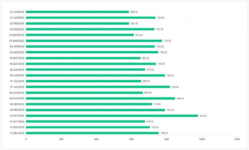
In the following article we will show you how to create a bar graph showing your monthly sales month over month for 2019 to 2020 using data from Dynamics GP in Popdock. Here is an example of 2019-2020 Month To Month Sales focused on Actual Quantity of products sold. Once you have this list created you can simply switch from Actual Quantity to Extended Amount to see your total sales amount for each month.
To achieve this we do need to create a few calculated fields that take the Document Date of the Sale Line Item and converts it to a string that is more easily sorted by using a number in front of the month abbreviation. For example convert 01-10-2020 to “01 JAN” and then another calculated field that converts the date to only the year. Then a third calculated field that merges those values back together so that the data can be easily sorted by month which will put month over month with 2019 over 2020.
Adding the Three Calculated Fields to Sales Line Items
Here’s a link to the KB Article on how to add a calculated field. We will jump straight into how to setup the three calculated fields needed.
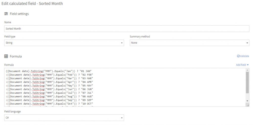
Sorted Month Calculated Field
Sorted Month is going to be a String Field type with no summary method and we have used the C# for the field language. Here is the formula so you can copy and paste it:
({Document date}.ToString(“MMM”).Equals(“Jan”)) ? “01 JAN”
:({Document date}.ToString(“MMM”).Equals(“Feb”)) ? “02 FEB”
:({Document date}.ToString(“MMM”).Equals(“Mar”)) ? “03 MAR”
:({Document date}.ToString(“MMM”).Equals(“Apr”)) ? “04 APR”
:({Document date}.ToString(“MMM”).Equals(“May”)) ? “05 MAY”
:({Document date}.ToString(“MMM”).Equals(“Jun”)) ? “06 JUN”
:({Document date}.ToString(“MMM”).Equals(“Jul”)) ? “07 JUL”
:({Document date}.ToString(“MMM”).Equals(“Aug”)) ? “08 AUG”
:({Document date}.ToString(“MMM”).Equals(“Sep”)) ? “09 SEP”
:({Document date}.ToString(“MMM”).Equals(“Oct”)) ? “10 OCT”
:({Document date}.ToString(“MMM”).Equals(“Nov”)) ? “11 NOV”
:({Document date}.ToString(“MMM”).Equals(“Dec”)) ? “12 DEC”
: string.Empty
This formula takes the date that is in the Document date field and converts it to the Sorted Month number and abbreviation that we need to be able to sort correctly.
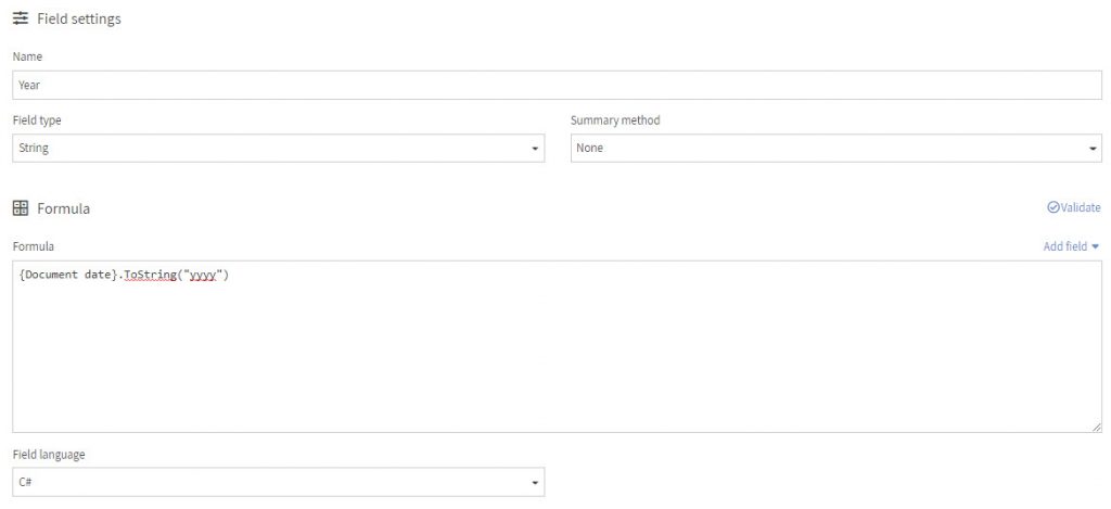
Year Calculated Field
The Year field will take the Document date field and convert it to show only the 4 digit year. This field will also be a String with no summary and using the C# field language. Here is the formula needed:
{Document date}.ToString(“yyyy”)
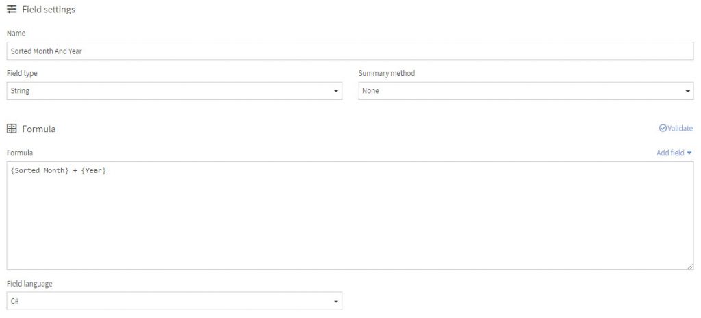
Sorted Month and Year Calculated Field
This field just combines the two previous calculated fields together making it easy to sort by month and it will put year over year in order as well. Here is the formula to combine two fields:
{Sorted Month} + {Year}
Now that you have the calculated fields added, we can open the list and create the graph.
Filtering Your Sales Line Items List
Before we start setting up the Bar Graph, we want to mention that the Sales Line Items will need to be filtered so you get the exact data that you want. These are the filters we have for this example:
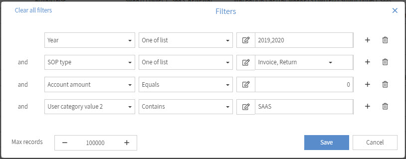
Year – One of list – 2019, 2020 – this gets me only data for these years.
SOP – One of list – Invoice, Return – this gets me only SOP type of Invoice and Return so that the data can be more accurate taking returns into consideration.
Account amount – Equals – 0 – this means invoice has been paid in full and that is our preferred way of reporting our sales.
User category value 2 – Contains – SAAS – this one is specific to a company that sells SAAS and wants to report on that specific data.
Max Records – depending on the amount of records you have returning you will want to increase this so that you can get all the data for 2019-2020.
Setting Up Your Bar Graph
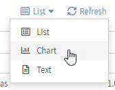
After you have configured your filter for your list, you can now go to configure your bar graph by switching from List to Chart from the dropdown menu above your list.
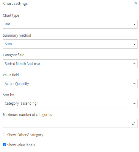
Then you should now have Chart settings on the right side, to match the graph I show for this example, it is a Chart type of “Bar”. The Summary method is set to “Sum”. Category field is “Sorted Month And Year” and the Value field for quantity is “Actual Quantity”. Then we are going to set the Sort by to “Category (ascending)”. This is important to sort it in order by the Sorted Month And Year field. For the Maximum number of categories I have set this one to 24 due to wanting to see the data for 2 years or 24 months. Last I have selected to show value labels so that each bar shows a value next to it.
Now you should see your month to month yearly sales for 2019 to 2020 and now you can compare your sales from 2019 to 2020 to see how your business has been doing during the current pandemic.
If you have any questions regarding any of the features mentioned here or any questions in general regarding Popdock, please reach out to our Support Team at support@popdock.com.